> ## Documentation Index
> Fetch the complete documentation index at: https://docs.getinteract.com/llms.txt
> Use this file to discover all available pages before exploring further.
# Charts, tables & KPIs
> Which visualisation fits which question — and how to ask for it in your prompt.
Your agent decides for itself how to present an answer. Most of the time that decision is good, but it can only work with what your question implies. If you know what you want to see, saying so in the prompt is the single most reliable way to get it.
This page lists every visualisation an agent can produce, when each one is the right choice, and the exact phrasing that steers the agent towards it.
## How a visualisation gets made
It writes SQL shaped for the visualisation — one column for the axis, one column per series.
The full result set is used, not just the rows you see summarised in chat.
Charts appear inline in chat. Tables and reports open in the right-side panel.
An agent can build up to **5 charts in one step**, so asking for several views of the same data in one prompt is efficient — you don't need a separate message per chart.
## Choosing a visualisation
| Your question is about… | Ask for | Example |
| ------------------------------------------ | --------------------------- | ------------------------------------------------------ |
| A metric moving over time | **Time series** | "Sessions per week for the last quarter" |
| Two metrics on different scales, over time | **Time series, dual axis** | "Revenue and orders per day, revenue on the left axis" |
| Composition over time (volume + mix) | **Stacked bars** | "Sessions per month stacked by channel" |
| Share of total over time | **100% stacked bars** | "Channel mix per month as a share of total" |
| Ranking — who's biggest | **Ranked bar** | "Top 10 campaigns by revenue" |
| Relationship between two metrics | **Scatter** | "Spend vs. ROAS per campaign" |
| Exact numbers, many columns | **Table** | "Table of campaigns with spend, CPA and ROAS" |
| Headline numbers at a glance | **KPI tiles** (in a report) | "Open with a KPI row for revenue, sessions and CVR" |
The single most common mistake is asking for a chart of *categories* over a date-style axis. If your X values are names — campaigns, channels, products, markets — ask for a **ranked bar**. Names stay readable next to each bar instead of being squeezed and rotated underneath.
## Chart types
### Time series
The default. A metric plotted over dates, or over any ordered category axis.
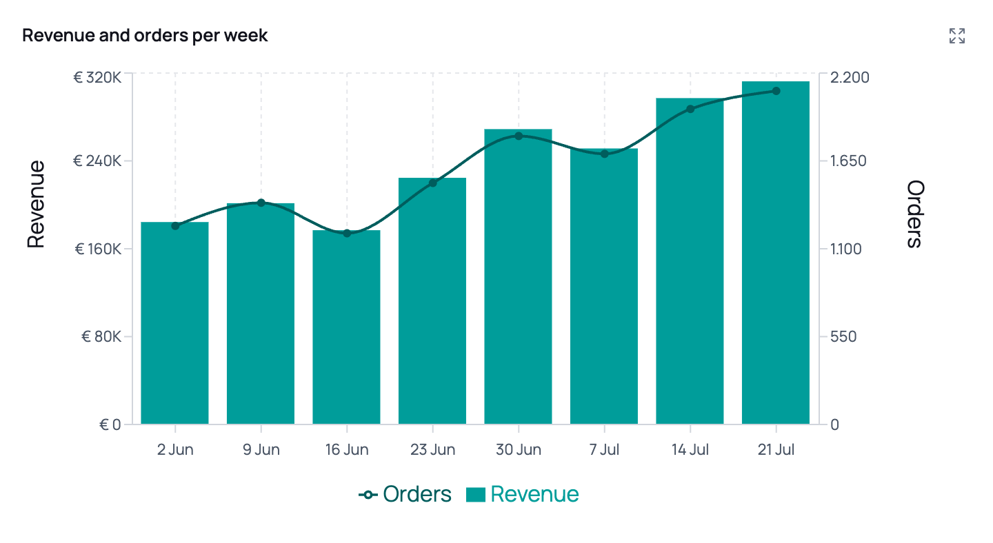 **What you can steer:**
| You want | Say something like |
| -------------------------------------- | ------------------------------------------------------------------------- |
| Lines instead of bars (or the reverse) | "Show that as a line chart" / "as bars" |
| A mix | "Revenue as bars with a line for the 7-day average" |
| Two different units together | "Revenue in euros on the left axis, transactions as a count on the right" |
| A target or benchmark line | "Add a reference line at €50,000" |
| A period called out | "Highlight the Black Friday week" |
| Values printed on the chart | "Put the values on the chart" |
Use a second axis when the two metrics have genuinely different units or magnitudes (revenue in euros vs. a count of transactions). Without it, the smaller series flattens into the baseline and tells you nothing.
Say which metric belongs on which side, and in which unit. The agent labels and formats each axis separately, so the right axis won't inherit a euro sign it shouldn't have.
Both are time-series only.
* **Reference lines** mark a threshold on either axis — a budget, a target CPA, a launch date.
* **Highlighted periods** shade a date range with an optional label — a campaign flight, a site outage, a promotional week.
Just describe them: *"mark our €2.50 target CPA"*, *"shade the two weeks the site was down"*.
**What you can steer:**
| You want | Say something like |
| -------------------------------------- | ------------------------------------------------------------------------- |
| Lines instead of bars (or the reverse) | "Show that as a line chart" / "as bars" |
| A mix | "Revenue as bars with a line for the 7-day average" |
| Two different units together | "Revenue in euros on the left axis, transactions as a count on the right" |
| A target or benchmark line | "Add a reference line at €50,000" |
| A period called out | "Highlight the Black Friday week" |
| Values printed on the chart | "Put the values on the chart" |
Use a second axis when the two metrics have genuinely different units or magnitudes (revenue in euros vs. a count of transactions). Without it, the smaller series flattens into the baseline and tells you nothing.
Say which metric belongs on which side, and in which unit. The agent labels and formats each axis separately, so the right axis won't inherit a euro sign it shouldn't have.
Both are time-series only.
* **Reference lines** mark a threshold on either axis — a budget, a target CPA, a launch date.
* **Highlighted periods** shade a date range with an optional label — a campaign flight, a site outage, a promotional week.
Just describe them: *"mark our €2.50 target CPA"*, *"shade the two weeks the site was down"*.
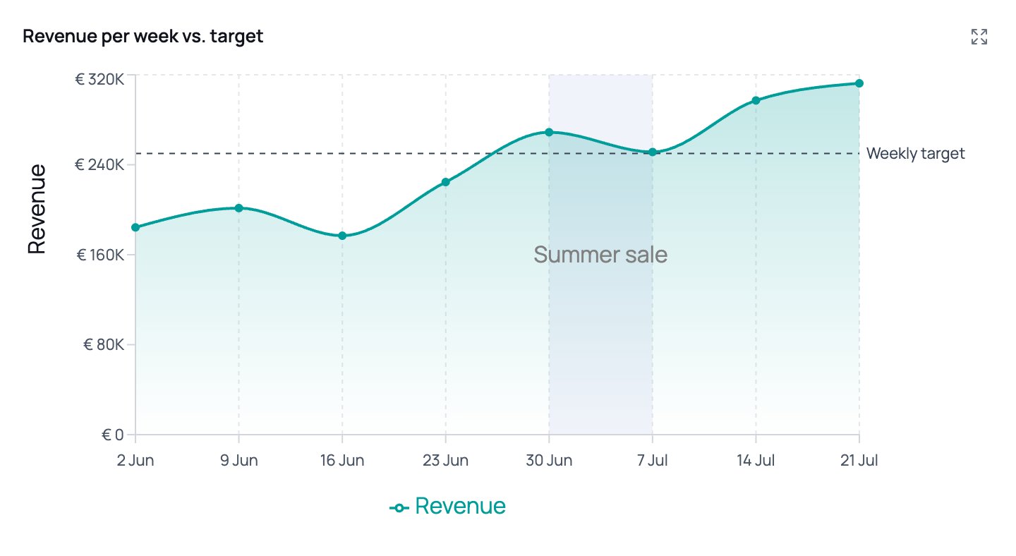 Reference line labels are drawn just past the end of the line and the chart makes room for them, so they don't need to be cryptic — but keep them under about 20 characters. Past that they're shortened with an ellipsis, and a long one eats into the width of the plot itself.
### Stacked and 100% stacked bars
Both stack the series on top of each other; they answer different questions.
| | **Stacked** | **100% stacked** |
| --------------- | --------------------------------------------- | ------------------------------------------------------------------- |
| Y-axis | Real values | 0–100% |
| Answers | "How big was the total, and what made it up?" | "How did the mix shift?" |
| Ask for it with | "stacked by channel" | "as a share of total", "as a percentage of sessions", "channel mix" |
The same data, both ways — note how the growth in total sessions is visible on the left and deliberately absent on the right:
Reference line labels are drawn just past the end of the line and the chart makes room for them, so they don't need to be cryptic — but keep them under about 20 characters. Past that they're shortened with an ellipsis, and a long one eats into the width of the plot itself.
### Stacked and 100% stacked bars
Both stack the series on top of each other; they answer different questions.
| | **Stacked** | **100% stacked** |
| --------------- | --------------------------------------------- | ------------------------------------------------------------------- |
| Y-axis | Real values | 0–100% |
| Answers | "How big was the total, and what made it up?" | "How did the mix shift?" |
| Ask for it with | "stacked by channel" | "as a share of total", "as a percentage of sessions", "channel mix" |
The same data, both ways — note how the growth in total sessions is visible on the left and deliberately absent on the right:
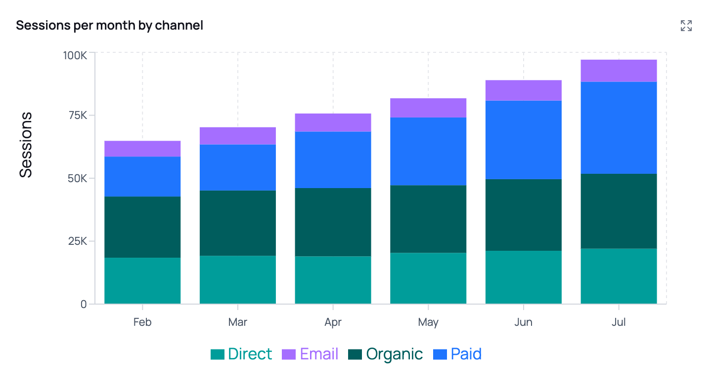
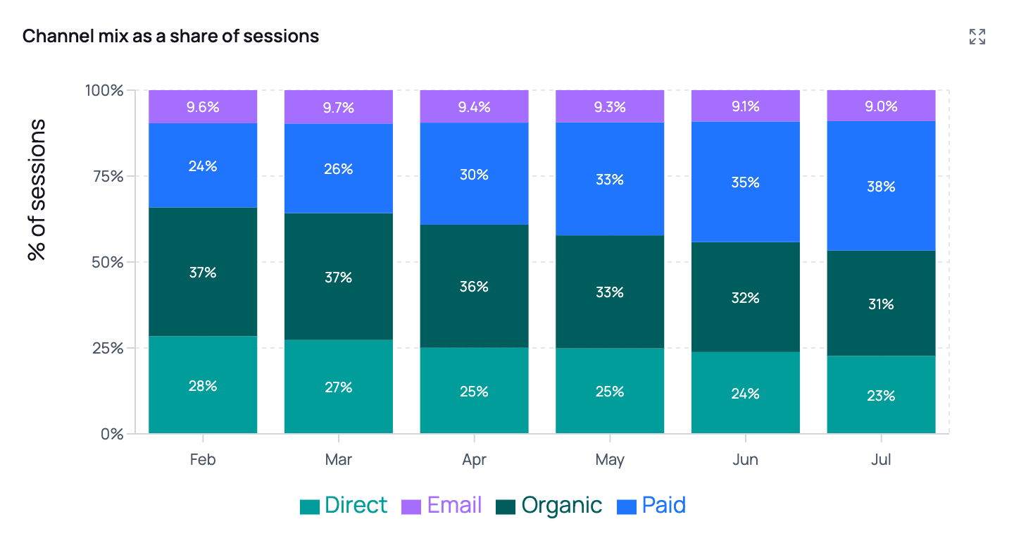 Use 100% stacked when the question is genuinely about mix — a channel split, a device split, new vs. returning. Volume changes disappear on that axis, which is the point, but it also means it's the wrong chart if you care how big the total got.
Either way, hovering a segment shows its share of that bar's total.
A 100% stacked chart needs **at least two stacked bar series** and can't be combined with a right-hand axis or an absolute value reference line — a fixed number has no meaning on a 0–100% axis. If you ask for a percentage view of a single metric, expect the agent to give you an absolute chart instead and say why.
### Ranked bar
Horizontal bars, ranked by value. The right choice for any "top N" or "who's biggest" question.
* Category names sit next to each bar, so long campaign names stay readable.
* Sorted largest-first by default; ask for "ascending" or "smallest first" to flip it.
* Ask for a specific cut-off: *"top 10"*, *"top 15 markets"*. Around 10 reads best; 50 is the maximum.
* Bars can be stacked too — *"top 10 campaigns by revenue, split by device"*.
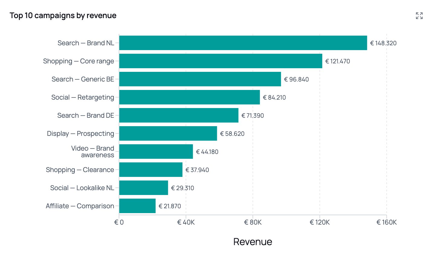
> "Top 10 campaigns by revenue last month, with the revenue shown on each bar"
Use 100% stacked when the question is genuinely about mix — a channel split, a device split, new vs. returning. Volume changes disappear on that axis, which is the point, but it also means it's the wrong chart if you care how big the total got.
Either way, hovering a segment shows its share of that bar's total.
A 100% stacked chart needs **at least two stacked bar series** and can't be combined with a right-hand axis or an absolute value reference line — a fixed number has no meaning on a 0–100% axis. If you ask for a percentage view of a single metric, expect the agent to give you an absolute chart instead and say why.
### Ranked bar
Horizontal bars, ranked by value. The right choice for any "top N" or "who's biggest" question.
* Category names sit next to each bar, so long campaign names stay readable.
* Sorted largest-first by default; ask for "ascending" or "smallest first" to flip it.
* Ask for a specific cut-off: *"top 10"*, *"top 15 markets"*. Around 10 reads best; 50 is the maximum.
* Bars can be stacked too — *"top 10 campaigns by revenue, split by device"*.
> "Top 10 campaigns by revenue last month, with the revenue shown on each bar"
 ### Scatter
Two numeric metrics against each other — the chart for "is there a relationship here?"
| Option | What it does | Ask for it with |
| ------------- | ---------------------------------------- | ----------------------------------------- |
| Bubble size | A third metric drives point size | "size the points by conversions" |
| Colour groups | One colour and legend entry per category | "colour by channel" |
| Point labels | Short label next to each point | "label each point with the campaign name" |
| Trendline | Least-squares fit, drawn with its R² | "add a trendline" |
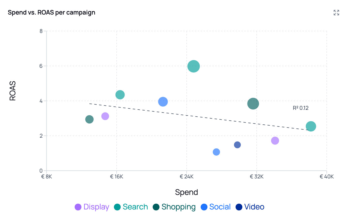
> "Scatter plot of spend vs. ROAS per campaign, coloured by channel, sized by conversions, with a trendline"
### Scatter
Two numeric metrics against each other — the chart for "is there a relationship here?"
| Option | What it does | Ask for it with |
| ------------- | ---------------------------------------- | ----------------------------------------- |
| Bubble size | A third metric drives point size | "size the points by conversions" |
| Colour groups | One colour and legend entry per category | "colour by channel" |
| Point labels | Short label next to each point | "label each point with the campaign name" |
| Trendline | Least-squares fit, drawn with its R² | "add a trendline" |
> "Scatter plot of spend vs. ROAS per campaign, coloured by channel, sized by conversions, with a trendline"
 A scatter needs at least two rows where **both** metrics are numeric and non-empty. Rows with a NULL on either axis are dropped, so a sparse metric can produce a much emptier chart than you'd expect from the row count.
## Making the numbers readable
Number formatting applies to axis ticks, tooltips and on-chart labels. It's worth being explicit about it, because a raw axis of `1234567.891` undoes an otherwise good chart.
| Format | Renders as | Ask for it with |
| ------------ | ------------------ | ----------------------------------- |
| Plain number | `1.234.568` | "as a plain number" |
| Compact | `1,2 mln`, `3,4 k` | "abbreviate the large numbers" |
| Currency | `€ 1.234.568` | "in euros", "as currency", "in USD" |
| Percentage | `23,4%` | "as a percentage" |
Numbers are formatted in Dutch notation (`nl-NL`) and default to euros. Ask for another currency by name if you need one. You can also set precision — *"two decimals"*, *"no decimals"*.
### Data labels
By default charts have no labels on the plot; the tooltip carries the detail. Ask for labels when the chart will be read on paper or in a slide where nobody can hover:
> "Show the values on the bars"
Labels are placed only where they measurably fit — labels inside stacked segments too thin to read are dropped automatically, and dense line charts stay clean. This means it's safe to ask for labels on a stacked chart. If you need *every* label regardless of overlap, say so, and keep the number of data points small.
## Tables
Ask for a table when the exact numbers matter, or when you want more columns than a chart can carry. Tables open in the right-side panel and can be sorted.
Columns can be styled by type, which you can request directly:
| Column type | Use for | Notes |
| ------------------- | ------------------------- | ---------------------------- |
| Title | The row's name | Emphasised first column |
| Value / Text | Plain numbers and strings | |
| Currency | Money | Defaults to euros |
| Percentage | A rate | e.g. conversion rate |
| Change vs. previous | Signed change | Coloured up/down, e.g. `+5%` |
| Badge | Short categorical labels | Market, status, channel |
| Tags | Multiple labels per row | |
| Rating | A 0–5 score | Rendered as stars |
> "Table of the top 20 products: product name as the title, revenue as currency, growth as a change column, and country as a badge"
## KPI tiles in reports
Reports can open with a row of KPI tiles — a scorecard of the headline numbers, each with an optional change vs. a comparison period.
Each tile carries:
* A **label** — the metric name
* A **value** — the formatted headline number
* An optional **delta** — the change, its comparison period ("WoW", "MTD", "vs target"), and whether that movement is **good or bad**
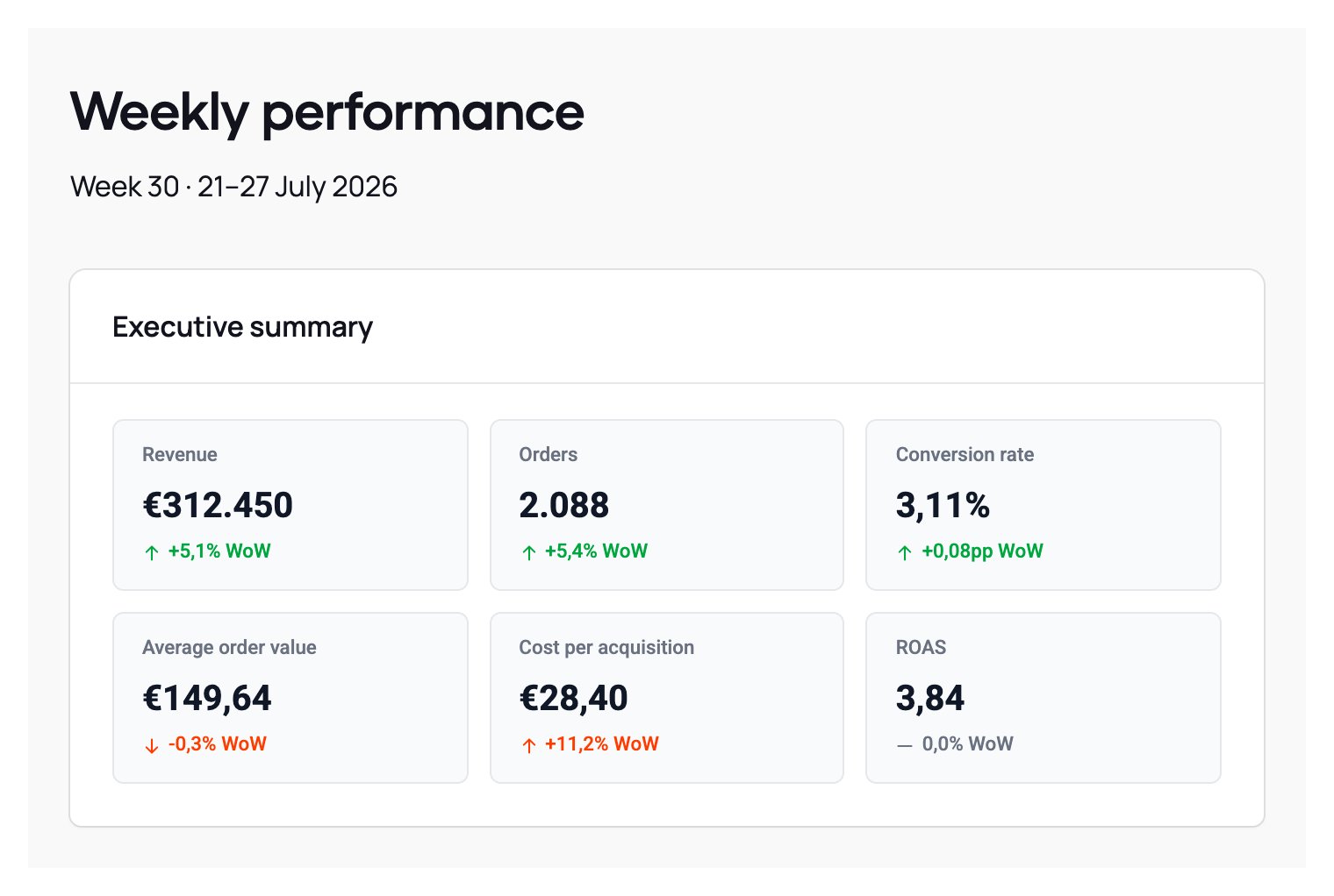
That last part matters and is worth stating in your prompt. Direction and sentiment are separate: cost per conversion going *up* is bad, conversion rate going *up* is good. Tell the agent which of your metrics are inverted and the colours will match:
> "Open the report with a KPI row for revenue, sessions, conversion rate and CPA, each with the week-over-week change. Remember CPA is a cost metric — rising CPA is bad."
A scatter needs at least two rows where **both** metrics are numeric and non-empty. Rows with a NULL on either axis are dropped, so a sparse metric can produce a much emptier chart than you'd expect from the row count.
## Making the numbers readable
Number formatting applies to axis ticks, tooltips and on-chart labels. It's worth being explicit about it, because a raw axis of `1234567.891` undoes an otherwise good chart.
| Format | Renders as | Ask for it with |
| ------------ | ------------------ | ----------------------------------- |
| Plain number | `1.234.568` | "as a plain number" |
| Compact | `1,2 mln`, `3,4 k` | "abbreviate the large numbers" |
| Currency | `€ 1.234.568` | "in euros", "as currency", "in USD" |
| Percentage | `23,4%` | "as a percentage" |
Numbers are formatted in Dutch notation (`nl-NL`) and default to euros. Ask for another currency by name if you need one. You can also set precision — *"two decimals"*, *"no decimals"*.
### Data labels
By default charts have no labels on the plot; the tooltip carries the detail. Ask for labels when the chart will be read on paper or in a slide where nobody can hover:
> "Show the values on the bars"
Labels are placed only where they measurably fit — labels inside stacked segments too thin to read are dropped automatically, and dense line charts stay clean. This means it's safe to ask for labels on a stacked chart. If you need *every* label regardless of overlap, say so, and keep the number of data points small.
## Tables
Ask for a table when the exact numbers matter, or when you want more columns than a chart can carry. Tables open in the right-side panel and can be sorted.
Columns can be styled by type, which you can request directly:
| Column type | Use for | Notes |
| ------------------- | ------------------------- | ---------------------------- |
| Title | The row's name | Emphasised first column |
| Value / Text | Plain numbers and strings | |
| Currency | Money | Defaults to euros |
| Percentage | A rate | e.g. conversion rate |
| Change vs. previous | Signed change | Coloured up/down, e.g. `+5%` |
| Badge | Short categorical labels | Market, status, channel |
| Tags | Multiple labels per row | |
| Rating | A 0–5 score | Rendered as stars |
> "Table of the top 20 products: product name as the title, revenue as currency, growth as a change column, and country as a badge"
## KPI tiles in reports
Reports can open with a row of KPI tiles — a scorecard of the headline numbers, each with an optional change vs. a comparison period.
Each tile carries:
* A **label** — the metric name
* A **value** — the formatted headline number
* An optional **delta** — the change, its comparison period ("WoW", "MTD", "vs target"), and whether that movement is **good or bad**
That last part matters and is worth stating in your prompt. Direction and sentiment are separate: cost per conversion going *up* is bad, conversion rate going *up* is good. Tell the agent which of your metrics are inverted and the colours will match:
> "Open the report with a KPI row for revenue, sessions, conversion rate and CPA, each with the week-over-week change. Remember CPA is a cost metric — rising CPA is bad."
 A KPI row holds up to **9 tiles**, laid out three per row. Ask for more than that and the agent will split them across separate rows or sections — which usually reads better anyway. Group them deliberately: one row for outcome metrics, one for efficiency metrics.
KPI tiles replace the old habit of stuffing metrics into a highlight box or a pipe-joined sentence. Use **highlights** for what they're good at — a single narrative callout, one key finding, a data quality flag.
## Structuring a report
Reports are built from blocks: text, lists, highlights, KPI rows, charts and tables. The agent will lay one out for you, but a prompt that specifies the structure gets a far more consistent result — especially for a report that runs on a schedule and needs to look the same every week.
> "Create a weekly performance report:
>
> 1. **Executive summary** — a short paragraph, then a KPI row with revenue, orders, AOV and ROAS, each with the week-over-week change.
> 2. **Trend** — revenue and orders per day, revenue on the left axis in euros, orders on the right as a count.
> 3. **Channel mix** — sessions per week as a 100% stacked bar by channel, with the percentages shown on the chart.
> 4. **Top campaigns** — ranked bar of the top 10 campaigns by revenue, plus a table with spend, CPA and ROAS.
> 5. **Recommendations** — a numbered list of at most five actions."
Reports built this way are the ideal thing to attach to a [scheduled job](/agents/jobs-scheduling) — write the layout once and a consistent, PDF-exportable report lands every week.
## Limits worth knowing
| | Limit |
| --------------------- | ------------------------------------------ |
| Charts per step | 5 |
| Tables per step | 5 |
| KPI tiles per row | 9 (3 columns) |
| Ranked bar categories | 50 (around 10 reads best) |
| 100% stacked | Needs 2+ stacked bar series, no right axis |
| Scatter | Needs 2+ rows with both metrics numeric |
## When you don't get the chart you asked for
You got a time series with a category axis. Ask for a ranked bar: *"show that as a ranked bar chart instead"*.
The two metrics are on incompatible scales. Ask for a second axis, or split them into two charts.
Say what the unit is: *"revenue is in euros — format the axis as currency and abbreviate the large numbers"*.
They should. For a 100% stacked chart, the agent reads the rendered percentages directly rather than recalculating them, so the narrative and the chart agree. If you see a genuine mismatch, flag the answer as incorrect so an admin can review it.
Rows shown inline in chat are a preview — charts and tables are always built from the complete result set, whatever the row count. If a limitation genuinely applies to your answer, the agent will state it explicitly.
When a correction is about your data rather than your question — *"the `revenue` column is in cents"*, *"CPA is a cost metric"* — add it to the agent's [context](/agents/settings/context) so you don't have to repeat it in every chat.
A KPI row holds up to **9 tiles**, laid out three per row. Ask for more than that and the agent will split them across separate rows or sections — which usually reads better anyway. Group them deliberately: one row for outcome metrics, one for efficiency metrics.
KPI tiles replace the old habit of stuffing metrics into a highlight box or a pipe-joined sentence. Use **highlights** for what they're good at — a single narrative callout, one key finding, a data quality flag.
## Structuring a report
Reports are built from blocks: text, lists, highlights, KPI rows, charts and tables. The agent will lay one out for you, but a prompt that specifies the structure gets a far more consistent result — especially for a report that runs on a schedule and needs to look the same every week.
> "Create a weekly performance report:
>
> 1. **Executive summary** — a short paragraph, then a KPI row with revenue, orders, AOV and ROAS, each with the week-over-week change.
> 2. **Trend** — revenue and orders per day, revenue on the left axis in euros, orders on the right as a count.
> 3. **Channel mix** — sessions per week as a 100% stacked bar by channel, with the percentages shown on the chart.
> 4. **Top campaigns** — ranked bar of the top 10 campaigns by revenue, plus a table with spend, CPA and ROAS.
> 5. **Recommendations** — a numbered list of at most five actions."
Reports built this way are the ideal thing to attach to a [scheduled job](/agents/jobs-scheduling) — write the layout once and a consistent, PDF-exportable report lands every week.
## Limits worth knowing
| | Limit |
| --------------------- | ------------------------------------------ |
| Charts per step | 5 |
| Tables per step | 5 |
| KPI tiles per row | 9 (3 columns) |
| Ranked bar categories | 50 (around 10 reads best) |
| 100% stacked | Needs 2+ stacked bar series, no right axis |
| Scatter | Needs 2+ rows with both metrics numeric |
## When you don't get the chart you asked for
You got a time series with a category axis. Ask for a ranked bar: *"show that as a ranked bar chart instead"*.
The two metrics are on incompatible scales. Ask for a second axis, or split them into two charts.
Say what the unit is: *"revenue is in euros — format the axis as currency and abbreviate the large numbers"*.
They should. For a 100% stacked chart, the agent reads the rendered percentages directly rather than recalculating them, so the narrative and the chart agree. If you see a genuine mismatch, flag the answer as incorrect so an admin can review it.
Rows shown inline in chat are a preview — charts and tables are always built from the complete result set, whatever the row count. If a limitation genuinely applies to your answer, the agent will state it explicitly.
When a correction is about your data rather than your question — *"the `revenue` column is in cents"*, *"CPA is a cost metric"* — add it to the agent's [context](/agents/settings/context) so you don't have to repeat it in every chat.