

How a visualisation gets made
The agent queries your data
It builds the chart, table or KPI row
It renders in chat, or gets embedded in a report
Choosing a visualisation
Chart types
Time series
The default. A metric plotted over dates, or over any ordered category axis.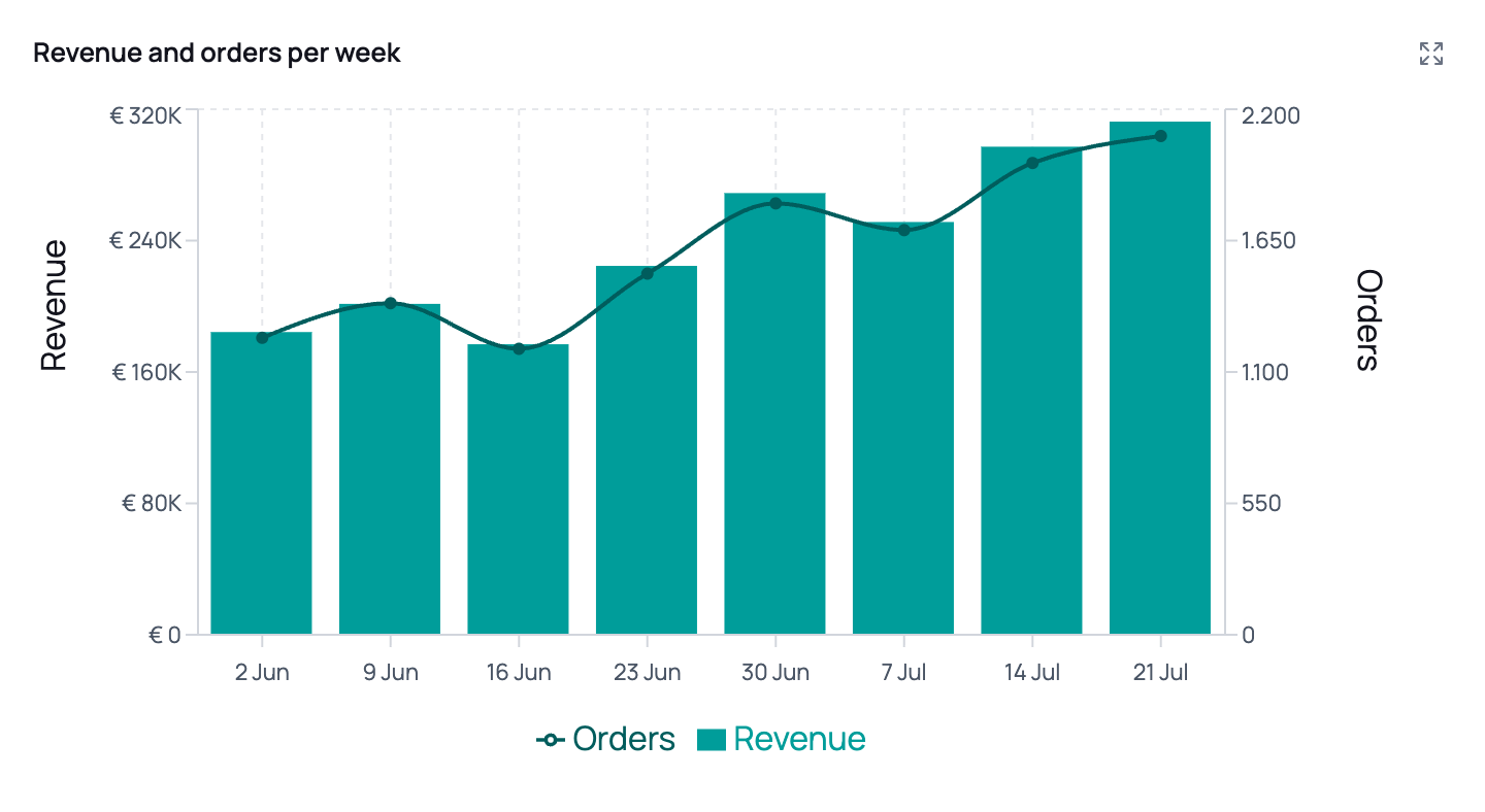
Bars and a line on two axes — revenue in euros on the left, order count on the right.
Dual axes — when to ask for them
Dual axes — when to ask for them
Reference lines and highlighted periods
Reference lines and highlighted periods
- Reference lines mark a threshold on either axis — a budget, a target CPA, a launch date.
- Highlighted periods shade a date range with an optional label — a campaign flight, a site outage, a promotional week.
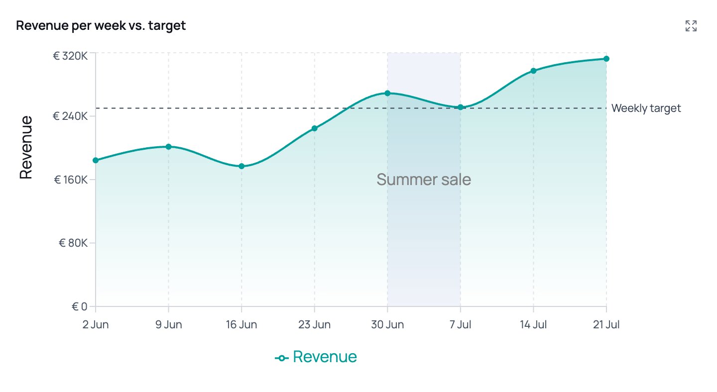
A single line with a gradient fill, a dashed target line, and a shaded, labelled period.
Stacked and 100% stacked bars
Both stack the series on top of each other; they answer different questions.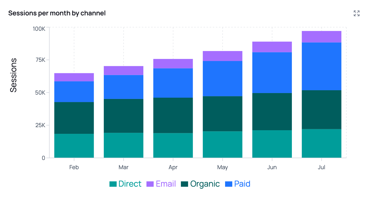
Stacked: total volume plus composition.
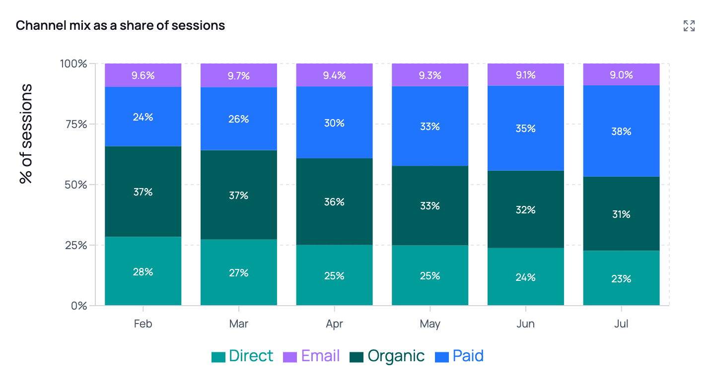
100% stacked: mix only, with auto data labels.
Ranked bar
Horizontal bars, ranked by value. The right choice for any “top N” or “who’s biggest” question.- Category names sit next to each bar, so long campaign names stay readable.
- Sorted largest-first by default; ask for “ascending” or “smallest first” to flip it.
- Ask for a specific cut-off: “top 10”, “top 15 markets”. Around 10 reads best; 50 is the maximum.
- Bars can be stacked too — “top 10 campaigns by revenue, split by device”.
“Top 10 campaigns by revenue last month, with the revenue shown on each bar”
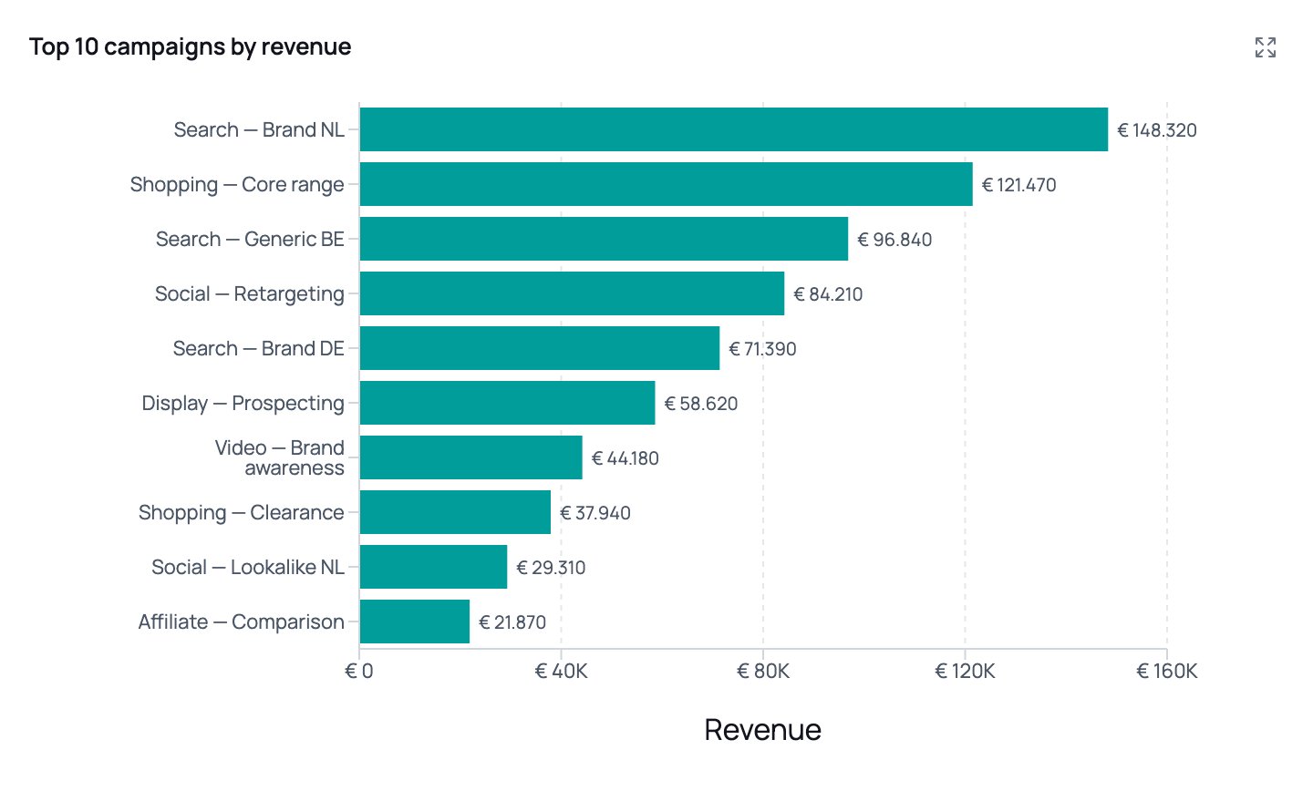
Long campaign names stay horizontal and readable; values are labelled at the end of each bar.
Scatter
Two numeric metrics against each other — the chart for “is there a relationship here?”“Scatter plot of spend vs. ROAS per campaign, coloured by channel, sized by conversions, with a trendline”
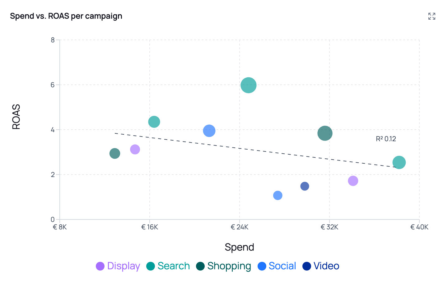
Bubble size is conversions, colour is channel, and the dashed trendline carries its R² — here 0.12, i.e. spend explains very little of the variation in ROAS.
Making the numbers readable
Number formatting applies to axis ticks, tooltips and on-chart labels. It’s worth being explicit about it, because a raw axis of1234567.891 undoes an otherwise good chart.
nl-NL) and default to euros. Ask for another currency by name if you need one. You can also set precision — “two decimals”, “no decimals”.
Data labels
By default charts have no labels on the plot; the tooltip carries the detail. Ask for labels when the chart will be read on paper or in a slide where nobody can hover:“Show the values on the bars”Labels are placed only where they measurably fit — labels inside stacked segments too thin to read are dropped automatically, and dense line charts stay clean. This means it’s safe to ask for labels on a stacked chart. If you need every label regardless of overlap, say so, and keep the number of data points small.
Tables
Ask for a table when the exact numbers matter, or when you want more columns than a chart can carry. Tables open in the right-side panel and can be sorted. Columns can be styled by type, which you can request directly:“Table of the top 20 products: product name as the title, revenue as currency, growth as a change column, and country as a badge”
KPI tiles in reports
Reports can open with a row of KPI tiles — a scorecard of the headline numbers, each with up to three changes vs. a comparison period. Each tile carries:- A label — the metric name
- A value — the formatted headline number
- Up to three deltas — each a change, its comparison period (“YoY”, “MoM”, “vs target”), and whether that movement is good or bad
“Open the report with a KPI row for revenue, sessions, conversion rate and CPA, each with the week-over-week change. Remember CPA is a cost metric — rising CPA is bad.”
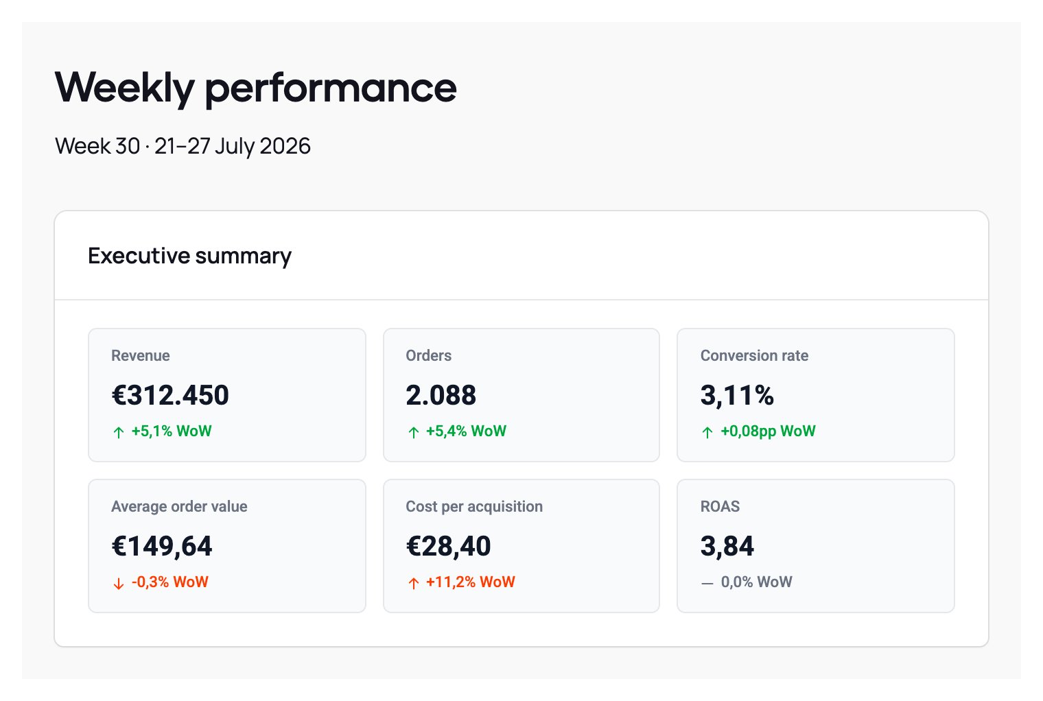
Six tiles in a 3-column grid. Cost per acquisition is up 11,2% and renders red with an up arrow, while revenue up 5,1% renders green — same direction, opposite sentiment.
Several comparisons on one tile
One number is rarely judged against one baseline. The same revenue figure usually matters against last year, against last month, and against target — so a tile can stack up to three comparisons under its value, each on its own labelled row:“Open with a KPI row for revenue, sessions and conversion rate. For each one show the change vs. last year and vs. target.”This is better than a tile per comparison: three tiles all headlined €23.144.526 make the reader work out that it’s the same number three times. Ask for the comparisons you actually want and the headline is stated once. Two things to know when you ask for several:
- Name each comparison in your prompt. The label beside each delta is the only thing telling a reader which baseline it is, so “vs. last year and vs. target” gets you two labelled rows, while “with the changes” may get you two numbers a reader can’t tell apart. Keep the labels short — they sit in a narrow column and are shortened with an ellipsis if long.
- The agent can only compare what the data holds. A comparison needs a column for it in the query behind the tile. If your dataset has no target figures, asking for “vs. target” will leave that row off rather than invent one — so if you want it, make sure a target column exists in the source data.
Structuring a report
Reports are built from blocks: text, lists, highlights, KPI rows, charts and tables. The agent will lay one out for you, but a prompt that specifies the structure gets a far more consistent result — especially for a report that runs on a schedule and needs to look the same every week.“Create a weekly performance report:
- Executive summary — a short paragraph, then a KPI row with revenue, orders, AOV and ROAS, each showing the change vs. last week and vs. last year.
- Trend — revenue and orders per day, revenue on the left axis in euros, orders on the right as a count.
- Channel mix — sessions per week as a 100% stacked bar by channel, with the percentages shown on the chart.
- Top campaigns — ranked bar of the top 10 campaigns by revenue, plus a table with spend, CPA and ROAS.
- Recommendations — a numbered list of at most five actions.”
Limits worth knowing
When you don’t get the chart you asked for
The category names under the chart are unreadable
The category names under the chart are unreadable
One series is a flat line at the bottom
One series is a flat line at the bottom
The axis shows unformatted numbers
The axis shows unformatted numbers
The percentages in the text don't match the chart
The percentages in the text don't match the chart
The agent says it can only see a few rows
The agent says it can only see a few rows